The golden thread running through the work is that we create brands for the environment, by using the environment they are in.
Whether using aerial shots of the wetlands to create a visual language with WWT, or the wide spectrum of colours of the ocean for NOC, the brand’s impact lies in its authenticity.
Through the new brand we needed to unlock the mystery of wetlands and convey their vital role – whilst still reflecting the history of the charity.
Founder Sir Peter Scott’s original drawing of two Bewick swans taking flight is a much-loved icon within the world of conservation. We delved into the archives to give the original mark a new lease of life.
We also thought who better to create a wetlands brand than the wetlands themselves? We used materials from wetlands to create illustrations that captured the textures and personalities of wetland wildlife, a distinctive colour palette inspired by a tapestry of unexpected colours found at wetlands. We also used aerial shots of wetlands to create an ownable visual language to help build brand equity within a saturated conservation charity market.
The tone of voice principles took inspiration from the spaces we’re striving to protect: Fresh, streamlined and full of wonder. This ensured WWT’s voice stood out and resonated with the audience, and was also embedded with meaning.
The brand has had a brilliant initial response, and is a bold first step from such an important charity to mobilise the nation to take action for wetlands
This was a really exciting opportunity to bring the world’s leading ocean research institute to a wider audience. The ocean is a subject we all can, and should, care about. Just 30% of our planet is covered by land, the rest is covered by ocean. It’s the lifeblood of our world.
The new brand transformed NOC from a corporate, plain brand that only spoke to academics, to one able to achieve cut-through and that can flex to reach a much wider audience.
The logo has a 70/30 split to represent the 70% ratio of our planet that is covered by the ocean. This means the logo always sits deep under the horizon line, as if it is submerged.
The colour palette and patterns are inspired by the ocean, and our illustrations were inspired by historical scientific illustrations, which brought the ocean to life in the early days of people’s exploration of it. We reinvigorated them with bold use of contrasting colours to ensure great visual impact.
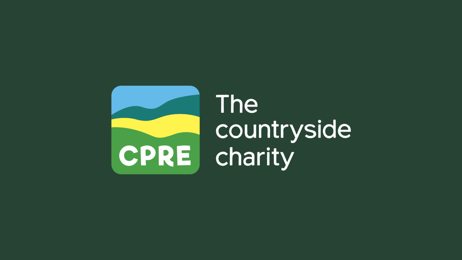
CPRE, the countryside charity, wanted to connect with a younger, more diverse audience and create a better understanding of what they actually do.
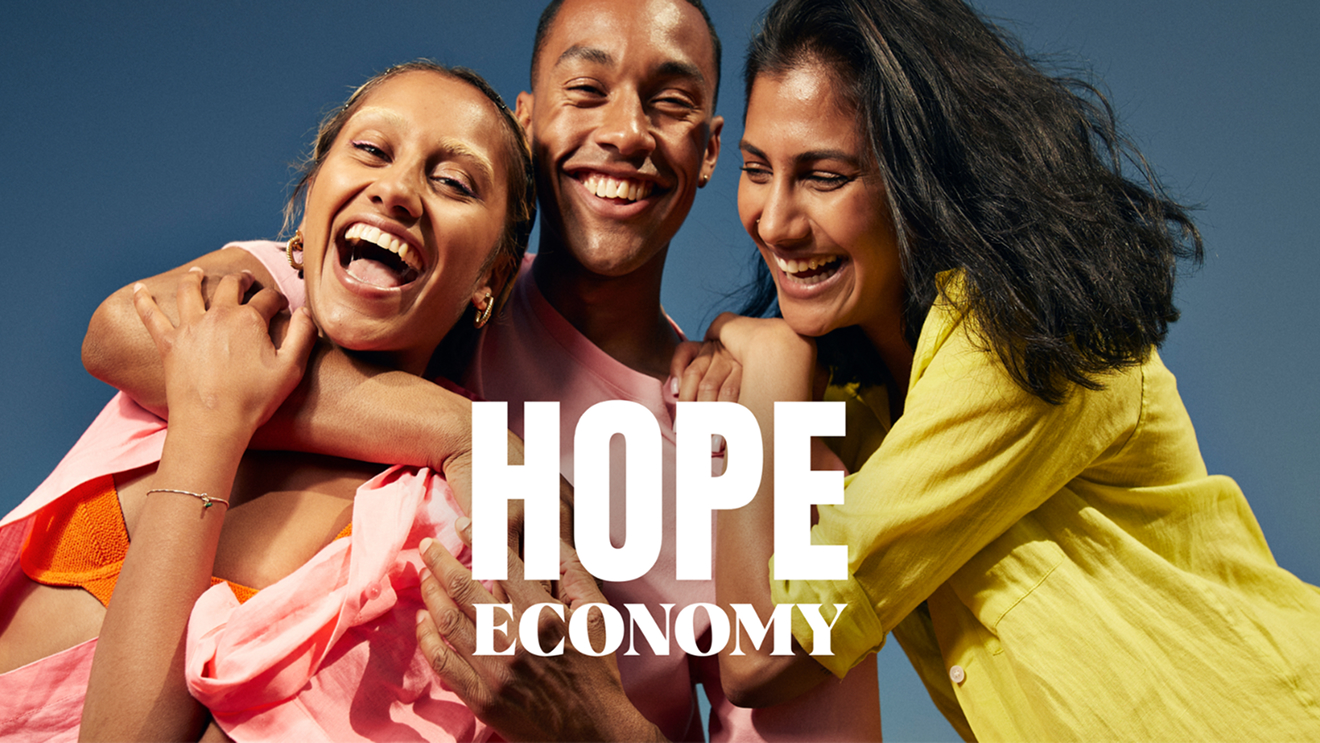
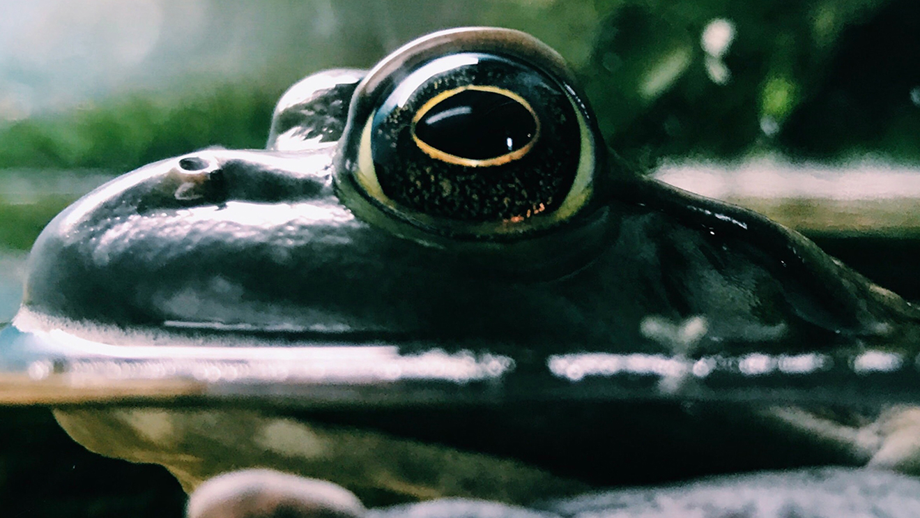
To bring the brand to life, we reminded audiences of the “why” they should care about the countryside through imagery that evokes the experience of being in the countryside. Whether it’s the direct soil on your hands, or the sensation of water on your feet, the imagery covered all aspects of the countryside from epic to intimate and detail.
We created a new logo as a symbol for the whole countryside, rather than a single aspect. Be it rolling hills or an aerial view of a coastal scene, people recall countryside scenes closest to them. We then went into the countryside itself to select the colour palette, choosing a range of positive colours.